library(ggmapcn)
#> Loading required package: ggplot2
# Define Azimuthal Equidistant projection centered on China
china_proj <- "+proj=aeqd +lat_0=35 +lon_0=105 +ellps=WGS84 +units=m +no_defs"
Introduction
The ggmapcn package provides various tools for visualizing geographic
data in China and beyond. This vignette demonstrates the basic and
advanced usage of geom_mapcn() and
geom_world() for plotting administrative boundaries and
combining geographic data.
Example 1: Basic Map of China
To draw a simple map of China with provincial boundaries, use
geom_mapcn(). By default, it uses an Azimuthal Equidistant
projection centered on China.
ggplot() +
  geom_mapcn() +
  geom_boundary_cn() +
  theme_bw()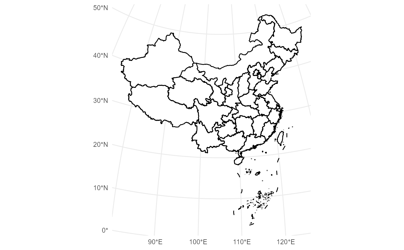
Example 2: Adding Buffer Zones and Coastlines
This example illustrates how to layer multiple geographic features—such as mainland buffers, coastlines, and administrative boundaries—onto a single map.
ggplot() +
  geom_buffer_cn(mainland_dist = 40000) +
  geom_buffer_cn(mainland_dist = 20000, fill = "#BBB3D8") +
  geom_mapcn(fill = "white") +
  geom_boundary_cn() +
  theme_bw()
#> Warning: attribute variables are assumed to be spatially constant throughout
#> all geometries
#> Warning: attribute variables are assumed to be spatially constant throughout
#> all geometries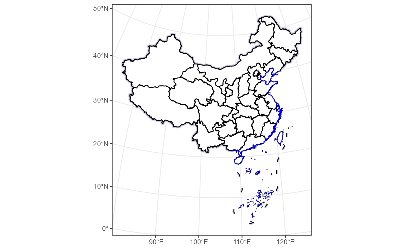
Example 3: Adding Spatial Point Data
The geom_loc function allows you to overlay spatial
point data onto your map. It supports both sf objects and
data frames containing longitude and latitude columns, and
can map aesthetics like color to categorical variables.
# Create a ggplot with spatial points colored by 'Category'
set.seed(123)
data_sim <- data.frame(
   Longitude = runif(100, 80, 120),
   Latitude = runif(100, 28, 40),
   Category = sample(c("Type A", "Type B", "Type C"), 100, replace = TRUE)
   )
ggplot() +
   geom_boundary_cn() +
   geom_loc(
     data = data_sim, lon = "Longitude", lat = "Latitude",
     mapping = aes(color = Category), size = 1, alpha = 0.7
   ) +
   theme_bw()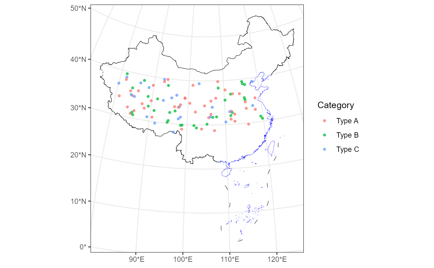
Example 4: basemap_vege: Vegetation Map of China Layer for ggplot2
Before using the function, ensure that the necessary data files are available by running:
# This function checks if the required data files are available
# It may take some time, especially if your network connection is slow.
  check_geodata(files = c("vege_1km_projected.tif"), quiet = FALSE)
The basemap_vege function adds a vegetation raster map
of China with color-coded vegetation types to a ggplot.
# Add vegetation raster of China to a ggplot
ggplot() +
  basemap_vege() +
  guides(fill = guide_none()) +
  theme_bw()
Example 5: basemap_dem: Elevation Map of China Layer for ggplot2
The basemap_dem function adds a digital elevation model
(DEM) raster map of China as a layer to ggplot2.
# Apply Azimuthal Equidistant projection centered on China
ggplot() +
  basemap_dem(crs = china_proj, within_china = TRUE) +
  geom_boundary_cn(crs = china_proj) +
  tidyterra::scale_fill_hypso_c(
    palette = "dem_print",
    breaks = c(0, 2000, 4000, 6000),
    limits = c(0, 7000)
  ) +
  labs(fill = "Elevation (m)") +
  theme_minimal() +
  theme(legend.position = "bottom")
#> <SpatRaster> resampled to 1000968 cells.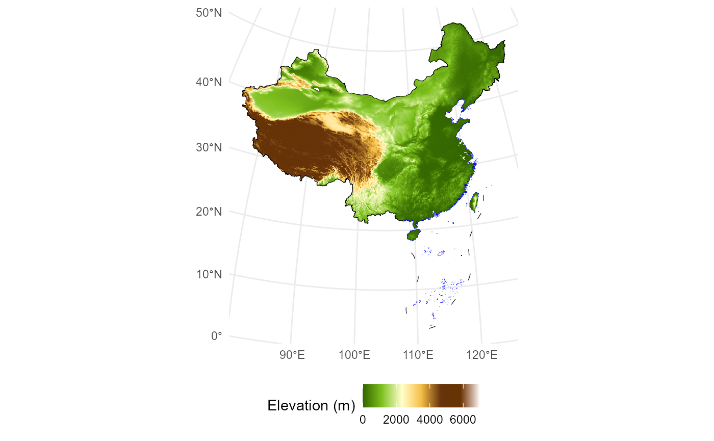
Example 6: coord_proj: Transforming Limits for Custom Projections
The coord_proj function simplifies working with custom
projections. It accepts map limits (xlim, ylim) in standard WGS84
longitude/latitude coordinates and automatically transforms them into
the specified CRS.
Here, the Azimuthal Equidistant projection centered on China is applied, with transformed map limits specified in longitude and latitude.
ggplot() +
  geom_mapcn(fill = "white") +
  geom_boundary_cn() +
  coord_proj(
    crs = china_proj,
    xlim = c(60, 140),
    ylim = c(10, 50)
  ) +
  theme_bw()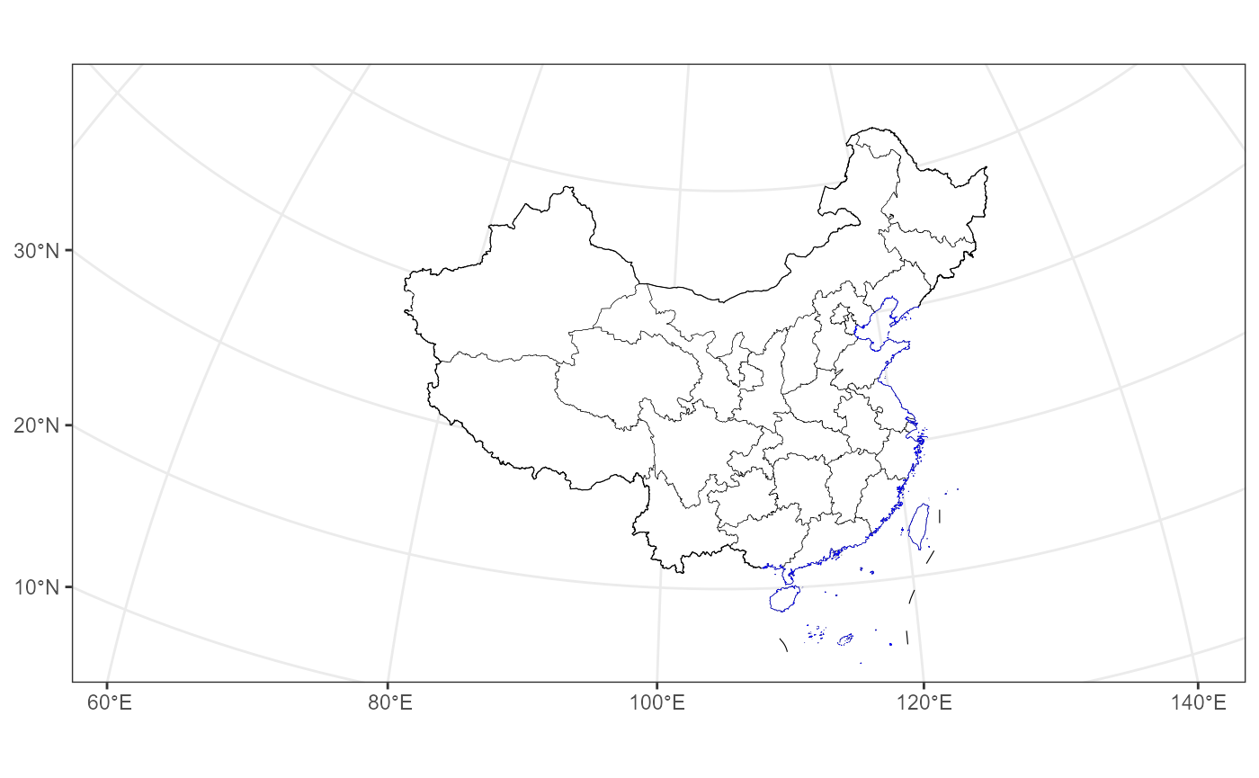
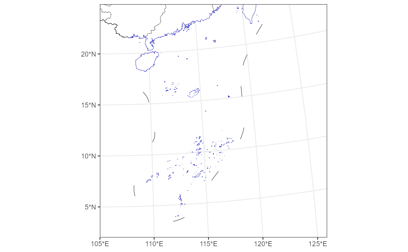
Additionally, we can focus the map on the South China Sea Islands. The longitude and latitude range shown here is for demonstration purposes only.
ggplot() +
  geom_mapcn(fill = "white") +
  geom_boundary_cn() +
  theme_bw() +
  coord_proj(
    crs = china_proj,
    expand = FALSE,
    xlim = c(105, 126),
    ylim = c(2, 23)
  )