World map overview with geom_world()
Source:vignettes/World_Map_Overview.Rmd
World_Map_Overview.Rmd1. Introduction
geom_world() provides a convenient global base map for
ggplot2. It comes bundled with country polygons,
coastlines, and political/administrative boundaries.
Key features include:
- Automatic CRS transformation: Seamlessly projects data to your desired Coordinate Reference System.
- Antimeridian splitting: Handles the “Pacific wrap-around” issue automatically when changing central meridians.
- Layer control: Toggles for ocean background and administrative boundaries.
2. Basic usage
2.1 Default WGS84 map
By default, geom_world() plots the map using the WGS84
standard.
ggplot() +
  geom_world() +
  theme_void()
2.2 Explicit CRS specification
You can specify the CRS directly within the function.
ggplot() +
  geom_world(crs = 4326) +
  coord_sf(crs = 4326) +
  theme_void()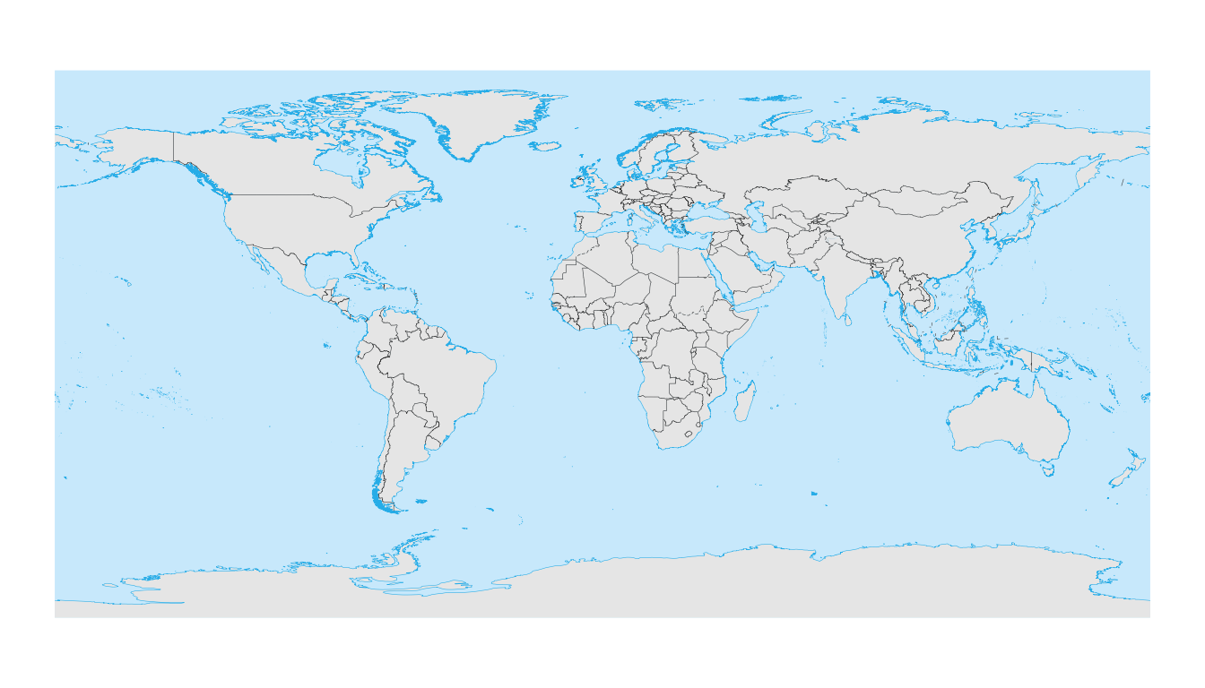
2.3 Hiding the ocean layer
For a cleaner look, you can remove the blue ocean background and change the land fill color.
ggplot() +
  geom_world(
    show_ocean   = FALSE,
    country_fill = "grey90"
  ) +
  theme_minimal()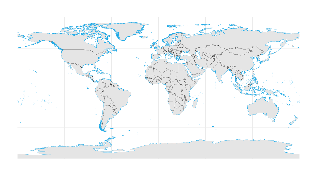
2.4 Hiding administrative boundaries
If you only need continental landmasses without internal country
borders, set show_admin_boundaries = FALSE.
ggplot() +
  geom_world(
    show_admin_boundaries = FALSE,
    country_fill          = "white"
  ) +
  theme_minimal()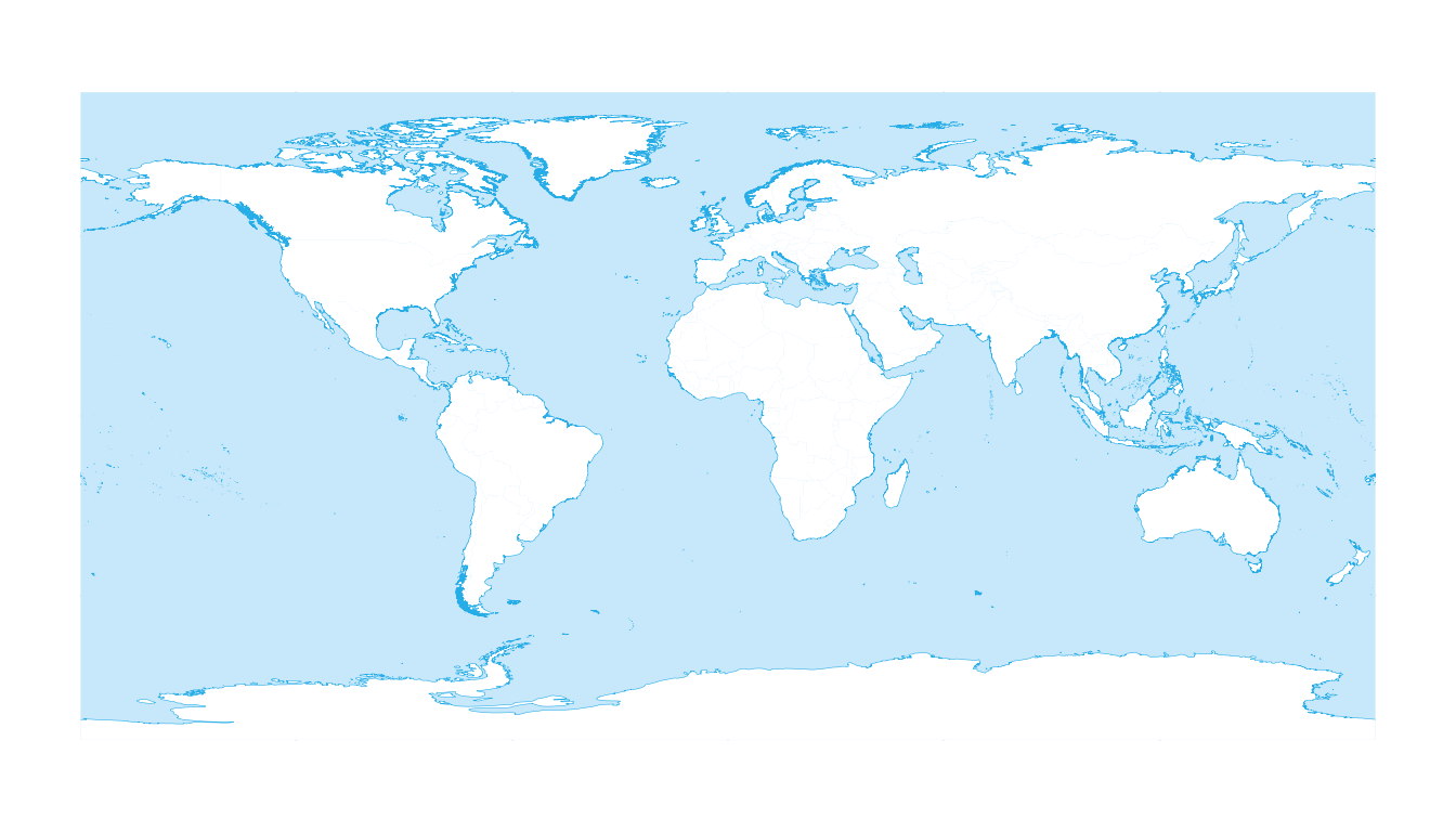
Combining both options creates a minimalist silhouette map:
ggplot() +
  geom_world(
    show_ocean            = FALSE,
    show_admin_boundaries = FALSE
  ) +
  theme_minimal()
3. Projections
geom_world() shines when working with different map
projections. It automatically projects the underlying polygons.
3.1 Robinson projection
crs_robin <- "+proj=robin +datum=WGS84"

ggplot() +
  geom_world(crs = crs_robin) +
  coord_sf(crs = crs_robin) +
  theme_void()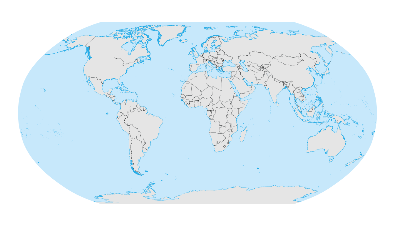
3.2 Robinson projection centred at 150°E
Changing the central meridian (centering the map on the Pacific) is
often difficult in standard ggplot2. geom_world() handles
the polygon splitting automatically.
crs_robin_150 <- "+proj=robin +lon_0=150 +datum=WGS84"

ggplot() +
  geom_world(crs = crs_robin_150) +
  coord_sf(crs = crs_robin_150) +
  theme_void()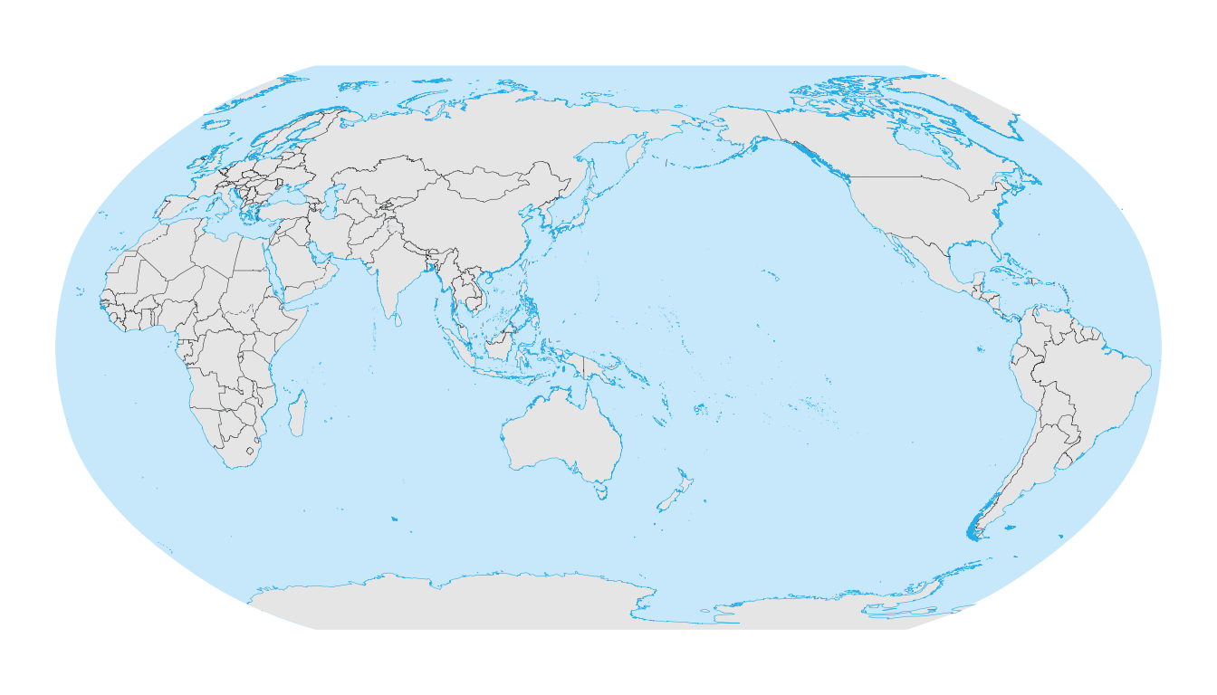
3.3 Geographic CRS with shifted central meridian
crs_wgs84_150 <- "+proj=longlat +datum=WGS84 +lon_0=150"

ggplot() +
  geom_world(crs = crs_wgs84_150) +
  coord_sf(crs = crs_wgs84_150) +
  theme_void()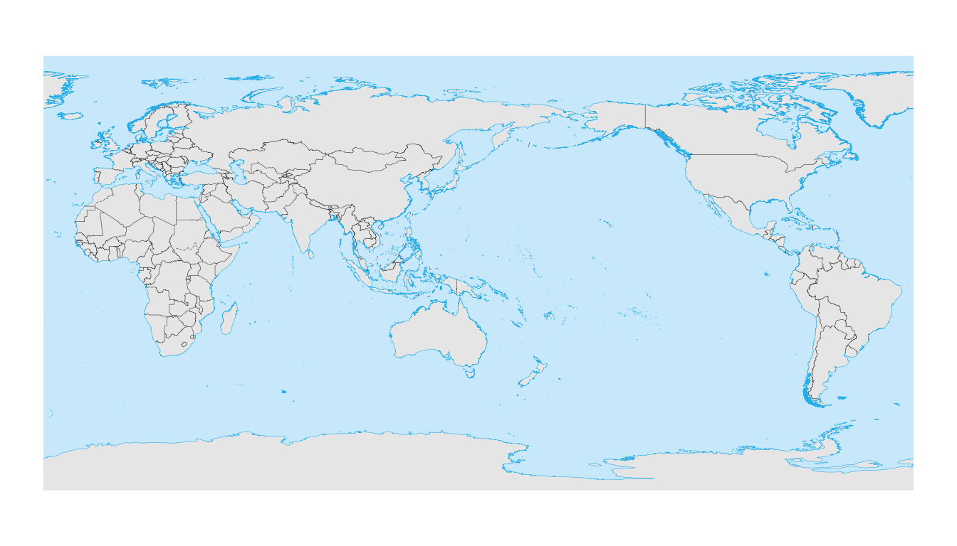
4. Axis labels and gridlines
A common issue with coord_sf() is that gridlines appear,
but axis labels (coordinates) disappear. This often occurs when:
-
expand = TRUEextends the map beyond ±180° or ±90°. - The CRS lacks a geographic datum.
- Solid layers (like the ocean polygon) are drawn on top of the panel grid.
Recommended pattern for reliable axis labels: Use
expand = FALSE inside coord_sf and set
panel.ontop = TRUE in the theme.
ggplot() +
  geom_world() +
  coord_sf(
    crs    = 4326,
    expand = FALSE,
    datum  = sf::st_crs(4326)
  ) +
  theme_minimal() +
  theme(panel.ontop = TRUE)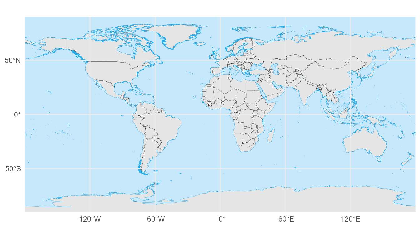
5. Graticule annotation (meridians & parallels)
annotation_graticule() provides precise control over
meridians and parallels. Unlike standard gridlines, these are annotation
layers that:
- Are generated in WGS84 and transformed to your target CRS.
- Allow for custom line spacing (
lon_step,lat_step) and label placement.
5.1 Global WGS84 map with graticules
ggplot() +
  geom_world() +
  annotation_graticule(
    lon_step     = 60,
    lat_step     = 30,
    label_offset = 5
  ) +
  coord_sf(
    crs    = 4326,
    expand = FALSE,
    datum  = sf::st_crs(4326)
  ) +
  theme_void() +
  theme(panel.ontop = TRUE)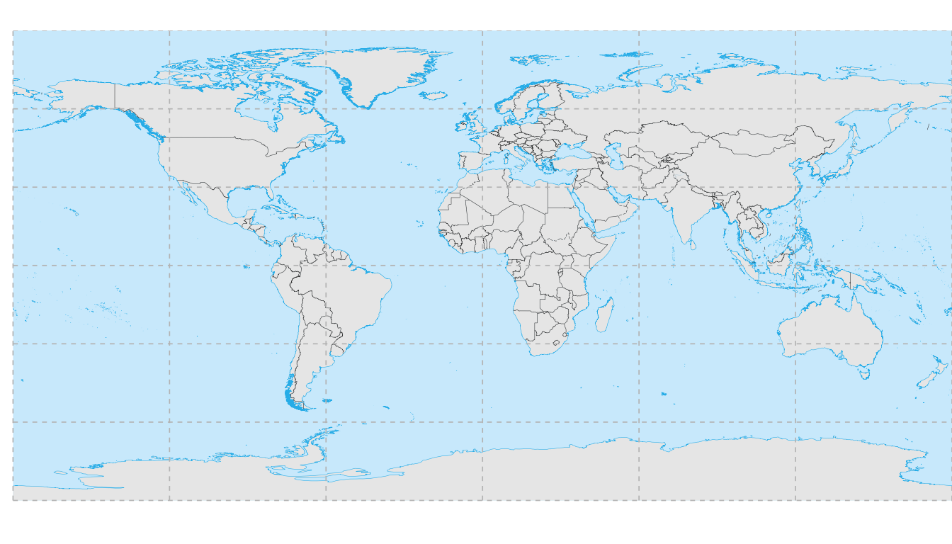
5.2 Robinson projection
Note how the graticules curve naturally with the projection.
crs_robin <- "+proj=robin +datum=WGS84"

ggplot() +
  geom_world(crs = crs_robin) +
  annotation_graticule(
    crs          = crs_robin,
    lon_step     = 30,
    lat_step     = 15,
    label_offset = 3e5
  ) +
  coord_sf(crs = crs_robin) +
  theme_void()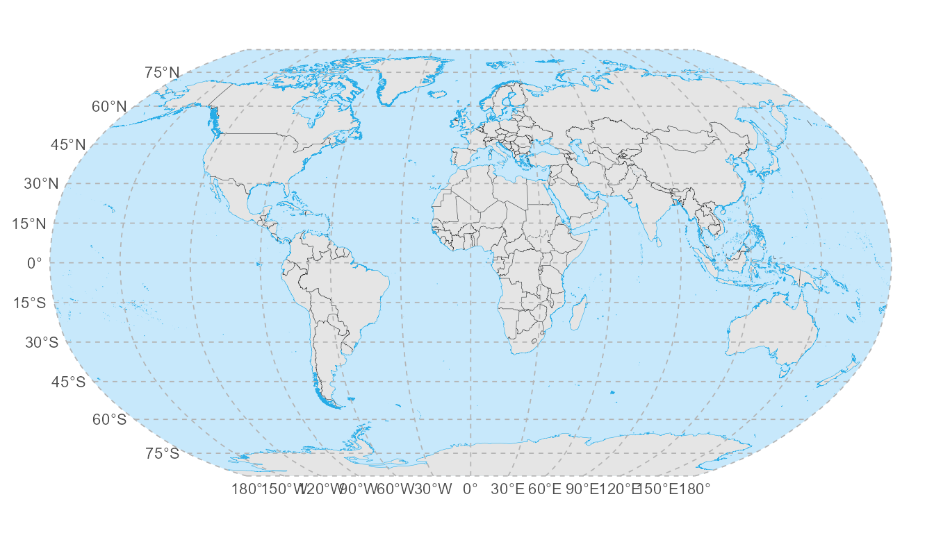
5.3 Regional China map (clean axis labels)
For regional maps, the recommended pattern is to:
- Use
annotation_graticule()to draw the lines but hide its internal labels (label_color = NA). - Use standard
labs()orcoord_sflabels for the axes. - Keep the region exact with
expand = FALSE.
cn_xlim <- c(70, 140)
cn_ylim <- c(0, 60)

ggplot() +
  geom_world() +
  annotation_graticule(
    xlim         = cn_xlim,
    ylim         = cn_ylim,
    crs          = 4326,
    lon_step     = 10,
    lat_step     = 10,
    label_color  = NA,
    label_offset = 1,
    label_size   = 3.5
  ) +
  coord_sf(
    xlim   = cn_xlim,
    ylim   = cn_ylim,
    expand = FALSE
  ) +
  labs(
    x = "Longitude",
    y = "Latitude"
  ) +
  theme_bw()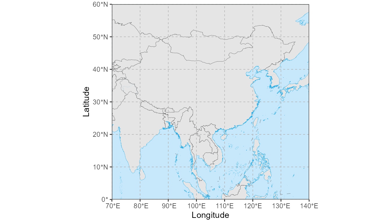
6. Highlighting selected countries
You can create “highlight” maps by layering geom_world()
calls. The first call draws the base (e.g., white), and the second call
filters for specific countries to color them.
6.1 Highlighting China
ggplot() +
  geom_world(
    country_fill = "white",
    show_frame   = TRUE
  ) +
  geom_world(
    filter_attribute = "SOC",
    filter           = "CHN",
    country_fill     = "red"
  ) +
  theme_void()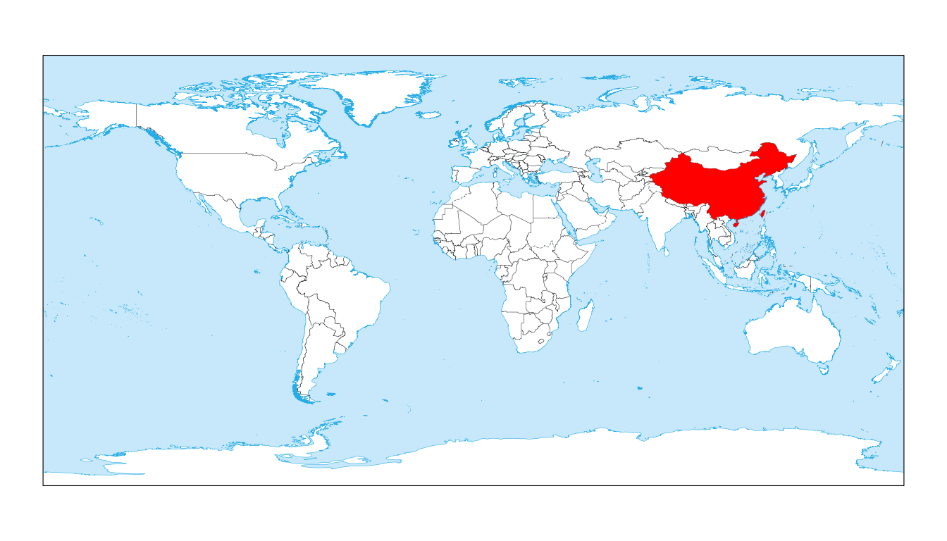
6.2 Highlighting multiple countries
Pass a vector of ISO codes to highlight multiple regions.
focus <- c("CHN", "JPN", "KOR")

ggplot() +
  geom_world(
    country_fill = "grey95",
    show_frame   = TRUE
  ) +
  geom_world(
    filter_attribute = "SOC",
    filter           = focus,
    country_fill     = "#f57f17"
  ) +
  theme_void()
7. Visualizing Custom Data
Users can also merge external datasets (e.g., GDP, population, or
other metrics) with the map data to create choropleth maps. This
requires accessing the underlying spatial data using
check_geodata and load.
7.1 Merging external metrics
First, ensure the necessary geospatial data files are available and load them. Then, merge your custom data using the ISO country code (SOC).
# 1. Ensure data availability and GET FILE PATHS
map_files <- check_geodata(c("world_countries.rda", "world_coastlines.rda"))
#> extdata dir: D:/Program Files/R-4.3.3/library/ggmapcn/extdata (writable = TRUE)
#> cache   dir: C:\Users\Administrator\AppData\Roaming/R/data/R/ggmapcn (writable = TRUE)
#> Using existing cache file: C:/Users/Administrator/AppData/Roaming/R/data/R/ggmapcn/world_countries.rda
#> Using existing extdata file: D:/Program Files/R-4.3.3/library/ggmapcn/extdata/world_coastlines.rda

# 2. Load the world countries data (object name: 'countries')
load(map_files[1])

# 3. Create custom data: Real 2023 Population Estimates (Top 25+ major nations)
# Unit: Millions
custom_data <- data.frame(
  iso_code = c("CHN", "IND", "USA", "IDN", "PAK", "NGA", "BRA", "BGD",
               "RUS", "MEX", "JPN", "ETH", "PHL", "EGY", "VNM", "COD",
               "TUR", "IRN", "DEU", "THA", "GBR", "FRA", "ITA", "ZAF",
               "KOR", "ESP", "COL", "CAN", "AUS", "SAU"),
  pop_mil  = c(1425.7, 1428.6, 339.9, 277.5, 240.5, 223.8, 216.4, 172.9,
               144.4, 128.5, 123.3, 126.5, 117.3, 112.7, 98.9, 102.3,
               85.8, 89.2, 83.2, 71.8, 67.7, 64.7, 58.9, 60.4,
               51.7, 47.5, 52.1, 38.8, 26.6, 36.9)
)

# 4. Merge custom data with the 'countries' object
# Note: Use 'all.x = TRUE' to preserve the map geometry for all countries
merged_data <- merge(
  countries,
  custom_data,
  by.x  = "SOC",
  by.y  = "iso_code",
  all.x = TRUE
)

# 5. Plot with layering strategy
ggplot() +
  # Layer 1: Data Fill (No borders, just color)
  geom_sf(
    data  = merged_data,
    aes(fill = pop_mil),
    color = "transparent"
  ) +
  # Layer 2: World Boundaries (Transparent fill, standard borders)
  geom_world(
    country_fill = NA,
    show_ocean   = FALSE
  ) +
  # Styling
  scale_fill_viridis_c(
    option    = "plasma",
    na.value  = "grey95",
    direction = -1,      # Reverse color scale so dark = high population
    name      = "Population (Millions)"
  ) +
  theme_void() +
  theme(legend.position = "bottom")
This workflow highlights a key design philosophy: by accessing raw
spatial data via check_geodata() and processing it with
geom_sf(), you gain complete flexibility to visualize
custom datasets. At the same time, overlaying geom_world()
ensures that the final map retains the consistent, high-quality basemap
and administrative boundary styles provided by ggmapcn.